VIRGIN ATLANTIC
Virgin Atlantic Self Serve Reward Vouchers
DISCOVERY
DESIGN WORKSHOP
STAKEHOLDER WORKSHOP
IDEATION
SKETCHING
PROTOTYPING
INTERNAL TESTING
USABILITY TESTING
SYNTHESIS & REPORTING
RESPONSIVE WEB
iOS/ANDROID

From contact centre to self-serve
Virgin Atlantic Flying Club members earn Reward Vouchers worth up to 150,000 points, depending on their tier. Redeeming them required a call to the contact centre, with long hold times, unsociable hours, and a conversation that left customers unsure whether they'd received the best value. Members had been asking for an online option for years, and the business wanted to make the entire journey self-serve. Firstly across the web offering, then a part migration of the new account and voucher pages to iOS and Android. The project began with the customer actively choosing how to apply their voucher, matching industry competitors. Partway through, senior leadership pushed for something simpler. They wanted the customer to book their flight, and the system would apply the best saving automatically, with no choice on whether it was a companion seat or a cabin upgrade. What nobody had considered was what it would take for a customer to trust a number they hadn't asked for and had no way to check. Closing that gap, without anyone having scoped it as a problem in the first place, became the real challenge. The resolution had two parts. The voucher page did the work of preparing the customer's mental model before they ever reached checkout, explaining that the system found the best saving automatically, and why the amount could vary from one booking to the next, without naming the rules behind it. Progressive disclosure then carried that through the rest of the journey: a Best Value badge at flight summary signalled that a calculation had run, and the full breakdown appeared at checkout, once a real number existed to attach it to. Neither the badge nor the breakdown arrived as a surprise, because the voucher page had already done the work of setting customer expectations.


Simplifying the proposition creates a harder design challenge
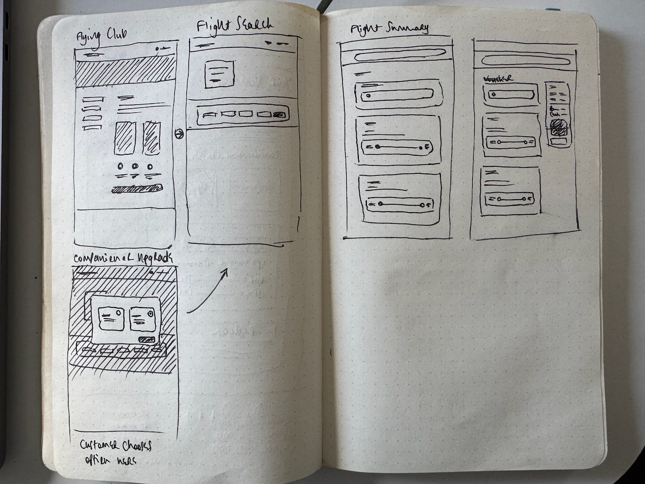
The final pattern with the Best Value badge, the per-passenger calculation breakdown wasn't the starting point. The original construct had the customer explicitly choosing between a companion fare and a cabin upgrade, and I spent several months building that out, including a fully interactive HTML prototype exploring the interaction design and the underlying business rules. Getting from that early construct to the version above took sevral rounds of iteration, and testing was how each iteration got proven or ruled out. For Rounds 1 and 2, I tested through UserTesting.com's standard panel, screened for loyalty programme members. That validated the mechanics of the flow, but the perticipnats ended up as mostly BA Avios members, not genuine Virgin Flying Club members; proxy loyalty behaviour, not the real audience. I identified that gap, and identified the fix: Virgin Atlantic already worked with an external insight community with a substantial Flying Club member panel, but it had only ever been used for Brand and major strategic research, never by the design department. I made the case to bring it into this programme instead, coordinating across research, product, finance, and procurement to secure the budget and set up access that hadn't existed for design use before. Round 3 justified the decision immediately. It produced the sharpest signal of the entire programme, not despite the audience change but because of it. Between rounds two and three, stakeholders removed the calculation figures from checkout against research recommendations. I defined a measurable threshold: if 3 or more participants selected the negative comprehension option, the data would support reversion. Three of 8 hit the threshold. The data made the argument. Round 4 restored the calculation expandable, this time as a complete breakdown at both flight summary and checkout, added a per-passenger price summary with voucher attribution, and refined the voucher page copy. The confidence collapse from Round 3 was eliminated: confidence rose continuously through the journey (4.17 to 4.67), the "50% discount" misframing disappeared entirely, and for the first time in the programme participants chose self-resolution options, shifting remaining contact centre demand from information-seeking to reassurance-seeking. Across every round, participants consistently found the redemption flow itself easy to use: "very easy, very explanatory," "pretty straightforward," "simpler than what I expected." What varied wasn't ease of use but whether customers trusted the figure they were being shown, and that trust only held once the calculation breakdown, not just the final number, was visible: "You have to trust that the system is doing the right thing and giving you the best saving, and it's demonstrated that it is as well." The design solutions in this case study (the voucher redemption pattern, the Best Value badge, the calculation breakdown, and the progressive disclosure approach that resolved the project's core trust problem) are my own work, developed and validated across four rounds of usability testing. I used Claude & Claude Design as a collaborator in two distinct parts of the process, at different stages. Early in the project, before a leadership decision simplified the redemption concept, I worked with Claude to build an interactive HTML prototype for the original construct, where customers actively chose between a companion or upgrade path: I supplied the underlying business rules, Claude built the interaction logic. Later, once the concept had changed and the trust problem I'd identified needed solving, I shared some sketches with Claude who then raised the idea of showing customers a comparison rather than a single hidden figure. What I ultimately built went further: surfacing the actual calculation mechanics, not just a comparison of outcomes, and the best value badge that both reinforced and made the best value claim transparent. For the research programme itself, I worked with Claude to draft and iterate the UserTesting.com scripts (task wording, question ordering, and trimming each script to fit the session time limit), and, after each round, to synthesise participant transcripts and metrics into structured findings that fed the next round's decisions.